Your visitors really want to read you. Are your fonts keeping them from doing so?
Finding and using easy to read fonts on your website will improve your visitor’s experience. However, typography is an important aspect we tend to ignore.
Carefully choosing our fonts is extremely important. Most readers click over to our sites wanting and expecting to read what we have published. But many times, between the wrong fonts and the sizes we choose, we make it very difficult for them to be able to read the content we work so hard on!
Many fonts, if used in the right size, weight and line-height can become easy to read. But tweaking that requires time, knowledge and in some cases, tweaking the code of your website to achieve the desired and an ideal result.
Most of us don’t have the knowledge, or simply don’t want to spend a lot of time on this when there are options that are far more simple to implement and use.
Here’s a compilation of my favorite free, easy to read fonts for websites and those I think are some of the best Google Fonts for legibility.
#Raleway
Raleway is an elegant font designed for large size text, for example, in headings. It was initially designed as a single thin weight, but it was then expanded and now has 9 weight variations.
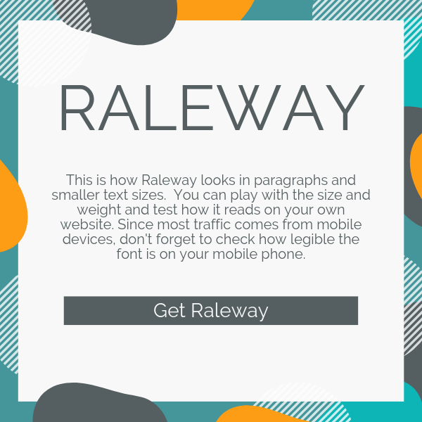
Get Raleway
#Muli
A minimalist font, Muli is designed to be used as a display (large size) font. However, it can perform well as a general text too.

Get Muli
#Hind
Hind is a typeface designed by Indian Type Foundry, specifically for user interface, so it comes as no surprise that this font is awesome when it comes to legibility! Indian Type Foundry is the creator of Poppins, another fabulous font that is amazing for legibility.

Get Hind
#Poppins
I have a thing for geometric sans serif typefaces, and Poppins is probably my all-time favorite out of all easy to read fonts. Not because it’s stylish. But it just reads so beautifully! It performs beautifully on long text and paragraphs. To me, Poppins is one of the best fonts to use as general body typography.
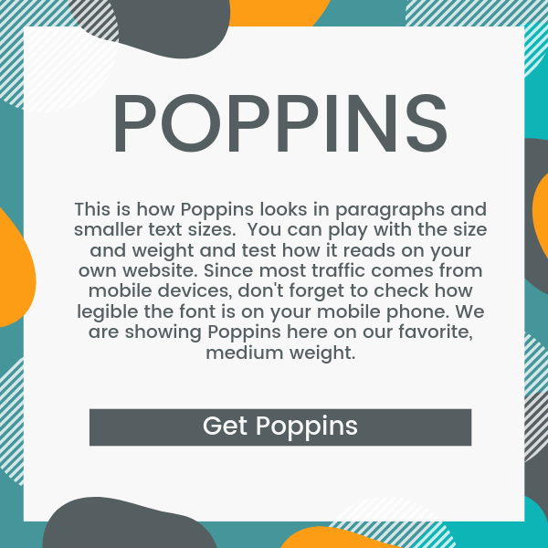
In Google Fonts words, “Each letterform is nearly monolinear, with optical corrections applied to stroke joints where necessary to maintain an even typographic color”. So that probably explains why I find it’s so easy on the eyes when reading long format content.
Get Poppins
#Cabin
#Martel Sans
#Open Sans
Open Sans is a friendly font that has great legibility. It is one of the most popular fonts used on the web and it was optimized for print, web, and mobile. So it’s no surprise that it is one of the most served fonts on Google Font.
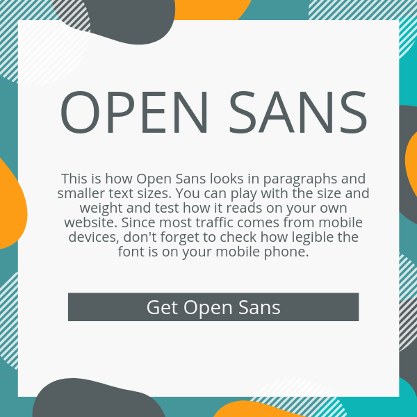
Get Open Sans
#Karla
According to Google Fonts, Karla is a grotesque sans serif typeface family. And it supports languages that use the Latin script and the Tamil script.

Get Karla
#Montserrat – not Sans Serif
Montserrat, originally designed by Julieta Ulanovsky, is an open-source project that was redrawn in 2017. Some of the changes were made so it works better in longer text.
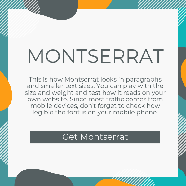
Get Montserrat
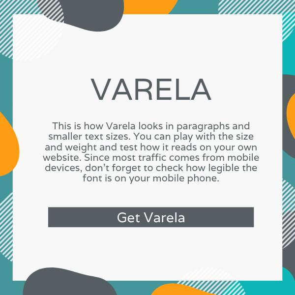
#Varela
Because of its minimalistic nature, and because its design is very clean, Varela is a great font for general text and long content. Along with Poppins, it’s one of my preferred choices when it comes to general body typography.
Get Varela
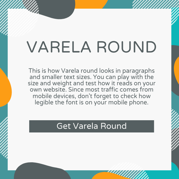
#Varela Round
Based on Varela, Varela Round has, as its name suggests, a more round feel. With its round corners, Varela Round is a great web font, and ideal to use on any website. Varela and Varela Round are a second close favorite among my top easy to read fonts!
Get Varela Round
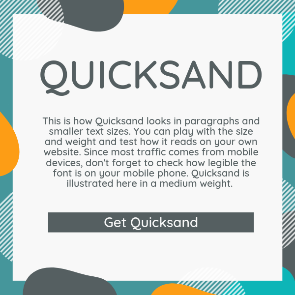
#Quicksand
Although Quicksand is a display font, it performs relatively well on smaller sizes too.
Get Quicksand
#Roboto
Roboto was designed and developed by Google to be used on Android. It has also been used on Youtube and Google Maps.

Get Roboto
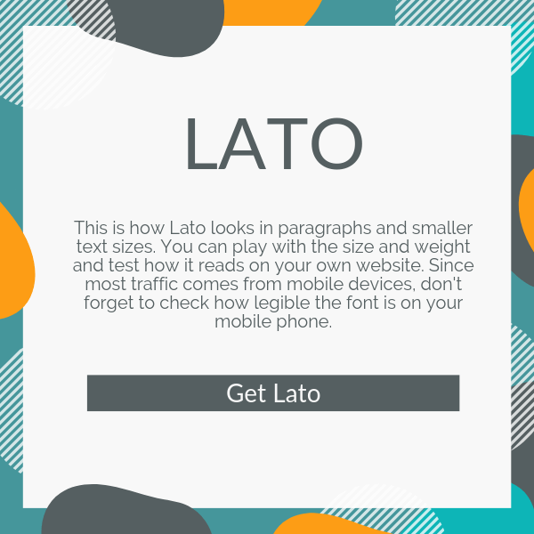
#Lato
A popular Google Font, Lato was designed in 2010. Its designer wanted it to work well for both small and larger texts.
Get Lato
#Oswald
With a goth vibe, and according to Google Fonts, “Oswald is designed to be used freely across the internet by web browsers on desktop computers, laptops, and mobile devices.”
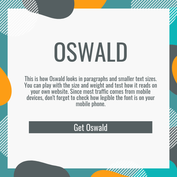
Get Oswald
#Ubuntu
Ubuntu is another open-source project developed around 2010 – 2011. It was designed with clarity for digital devices in mind.

Get Ubuntu
#PT Sans
PT Sans was developed as part of the project “Public Types of Russian Federation.” It has 8 styles.
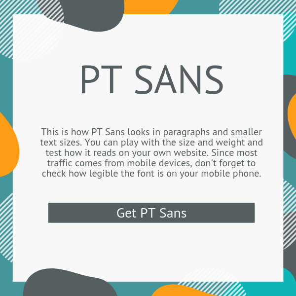
Get PT Sans
#Nunito
Nunito has two versions, Nunito, and Nunito Sans. Nunito does well both as a Large text font and at smaller scale text.

Get Nunito
Check out our comprehensive guide on how to improve all aspects for better legibility on your website.
 https://theblogforbloggers.com/wp-content/uploads/2019/08/cropped-the-blog-for-bloggers-logo-1-2.png
360
60
https://theblogforbloggers.com/wp-content/uploads/2019/10/easy-to-read-fonts-3-1-1024x683.png
800
534